 Concept design for Virtual Museum app by Offriginal on Dribble Museums benefit greatly from memberships, as do members. Members of museums have four and a half times the long-term value of non-members, according to IMPACTS, a cultural institution research firm (Dilenschneider, 2019). Members typically benefit by receiving free admission, access to member-only events, discounts at gift shops, on special events, and more. Interestingly, free admission is not the only driver of membership purchases; another is the concept of supporting the museum’s mission. This ranks second, closely behind free admission as one of the top-ranked reasons for joining (Dilenschneider, 2018). In other words, a visitor who becomes a member is an admirer, a fan, and believes in the museum's values. This suggests that membership is a win-win for all parties. It is perplexing then why cultural organizations in our digital era, with the ubiquitous use of Zoom, live streaming, etc. in the post-COVID era have not leveraged digital capabilities as an opportunity by offering online memberships. I am suggesting that an online membership tier be added to a museum's membership offerings--one that is at a slightly reduced rate from the museum's traditional membership price point. Some museums do offer online events that include courses, talks, live stream events, etc., which makes me think there is an opportunity to offer online visitors who are already engaged and interested, membership options. Doing so would create a relationship between the online visitor-turned-member and the organization. What Is Offered Online?Museums that do offer online events include The National Gallery in London, The Frick, The Met, The Barnes Foundation. Events include courses, talks, draw-and-learn sessions, lectures and more. Some are free, others are fee-based, and some, specifically at The National Gallery offer member-only online events (included in traditional memberships), though events are not promoted as a benefit. Below is a selection of event calendars that include online options.
Unfortunately, the majority of museums don't offer events for digital audiences, including the world's most visited institutions such as the MoMA and the Louvre. Nor do they, or the ones I mentioned above, offer online memberships.  Museums Shift to Digital – Or Not?Surprisingly, museums that offered more digital content during COVID are now scaling back. A study conducted by Katherine Jones and Kathryn Petterson shows that 54 percent of museums surveyed in 2021 reduced their digital offerings post-COVID, and 7 percent ceased their digital output entirely (Lu, 2021). Considering that museum attendance in the first quarter of 2023 is projected to be less than that in 2019, according to IMPACTS data, it would seem that museums need to think outside the box, literally, to leverage opportunities to increase visitor numbers and potential members (Dilenschneider, 2023). It seems a no-brainer for museums to develop a strategy to garner visitors digitally and offer exclusive online-only memberships. And to clarify, by engaging visitors online I do not mean with "virtual tours," which are typically a clunky and cumbersome method to view paintings or artifacts. By engaging members online, I mean by offering online events, exclusive digital content, including videos, live streamed events, and interactive digital elements that explore or share the institutions’ artifacts or content. Three Suggestions for Museums’ Digital Revamp To begin, museums' websites should be revamped so that they target ALL visitors, including digital ones. Most museum websites are geared to in-person visitors with the message "plan your visit" featured on the home page. Why not include online visitors in the "plan your visit" invitation? Suggestions for a Digital Revamp
There is no doubt that the above suggestions for online memberships and digital programming requires a shift in strategy, yet the benefits of including digital visit strategies are exponential for museums and visitors. References
 Really! I just launched Art History For Real, an online learning platform that delivers unconventional learning experiences about art history with online self-paced, courses available in two formats, Mini Courses and Deep Dives. My goal is to bring the inspirational world of art to learners with courses that teach art differently than traditional online or in-person art history classes or museum programs. Art History For Real courses share art and its stories through a modern lens. My goal is to make art relevant, fun, instructive and inspirational. And most importantly, that it connects to learners’ life experiences. Why I Started Art History For Real Debbie Morrison, Art History For Real, Founder Debbie Morrison, Art History For Real, Founder As a museum-goer, educator and docent I saw how people wanted to experience art and culture in museums but couldn’t because of barriers inherent to museum experiences that included and were not limited to: unwelcoming environments and elitist attitudes. With COVID there are additional barriers that make visiting museums onerous and, in some cases, impossible! Visitors getting to museums is not the only challenge, cultural institutions are struggling with making themselves appear relevant and in-tune with the real world. I decided to create an alternative for people to engage with art. I put my twenty-plus years’ experience in curriculum design, Master’s Degree in education, background in art history and passion for sharing art with others to work by creating approachable learning experiences that inspire new ways of thinking about art, other cultures and life. Learning experiences at Art History For Real (AHFR) are unique with courses that explore art through unconventional lenses, like Fashionistas That Rocked Art History and 7 Kickass Women in Art History. Courses and conversations are designed to involve learners with interactive content and reflection activities that prompt learners to consider and apply insights to their own work and life experiences. Passive online learning about art history is out, engaged learning is in! Unique Learning Experiences Mini Courses Mini Courses are short, two-to-three-hour courses that present art history through a modern lens with courses such as 7 Kickass Women in Art History and A Short History of Wine Drinking Culture through 7 Famous Paintings. Content is divided into ten-minute learning chunks or segments and include: images of artworks, interactive digital collages and images, exploration videos, stories and more—all designed to entertain, motivate and inspire. Reflection activities are designed to involve learners by posing questions to prompt thought and reflection, and to challenge learners to consider different perspectives. Other activities encourage leaners to apply their ideas and opinions through writing or creating. Learners are also invited to participate in course discussion forums to share opinions. Learning, as all educators know, is not achieved through passive consumption of content, but requires learners do something with the content through a mode of application. That is the goal with Mini Courses, to foster inspiration, ideas and new perspectives about culture, art and current events with engaged learning.  Deep Dives Deep Dives are in-depth courses that focus on more traditional topics of art history, and dig deep into key topics of art and culture from real-world perspectives. Courses are self-directed, fully online and divided into eight modules with over twenty hours of learning content delivered in condensed segments. Learners’ journeys can be as deep or broad as they choose. Content includes videos, journal articles, textbook readings, images, interactive digital collages, and more. Module assignments include reflection activities, writing assignments, artworks analysis and creating visual projects. Assignments are designed to promote thought, build knowledge and develop skills of interpretation and cultural analysis. In keeping with the philosophy of self-directed learning, leaners complete self-assessment using self-grading tools. Who is Art History For Real For?Art History For Real is for people who are curious, who want to engage and be active in exploring art and its history, consider different cultures and viewpoints and be part of a learning community. I invite you to explore our courses at Art History For Real to learn more, and to sign up for a free preview of any course. Join us and be part of a learning community! You can us on Instagram.
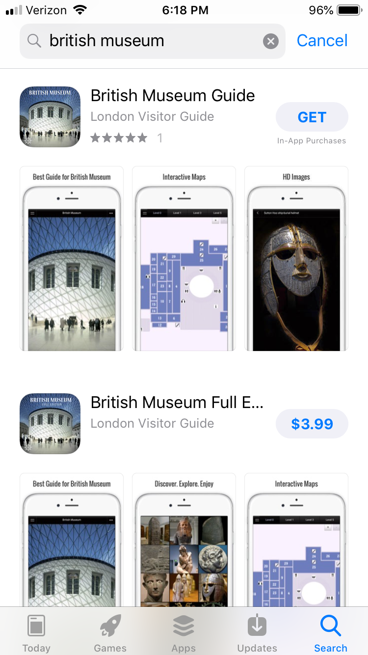
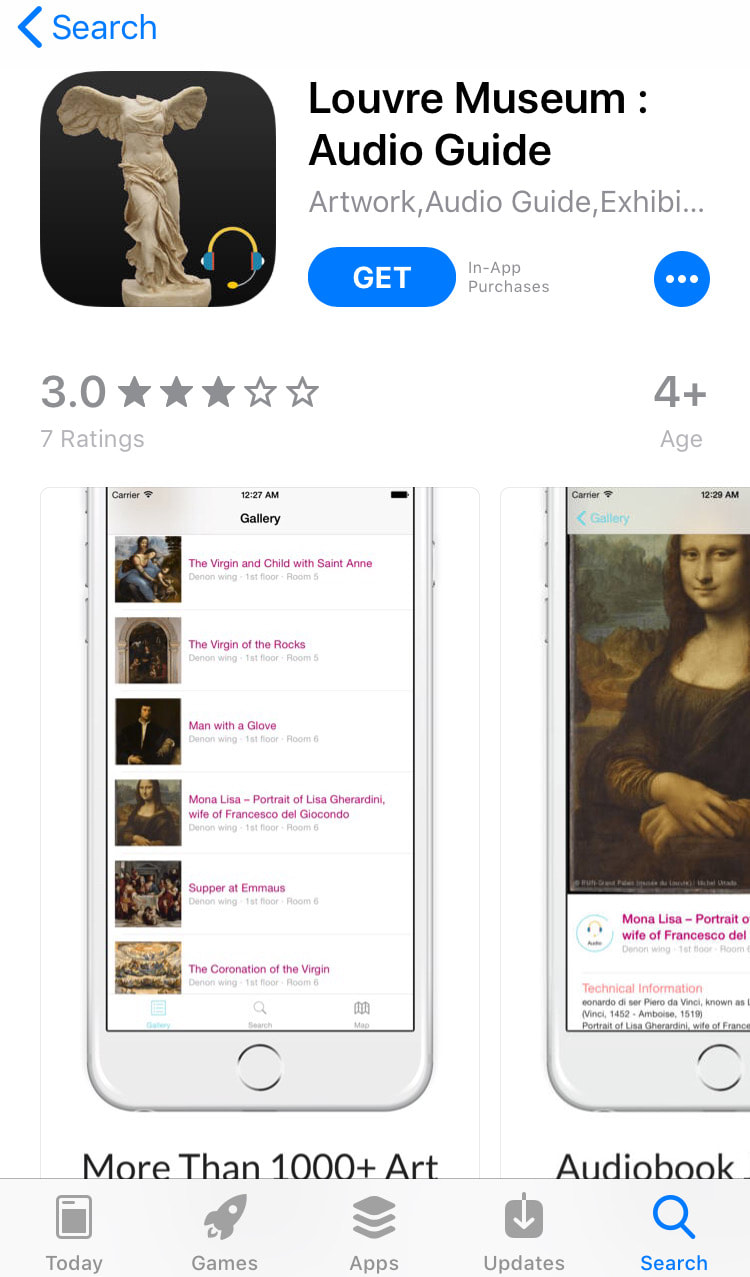
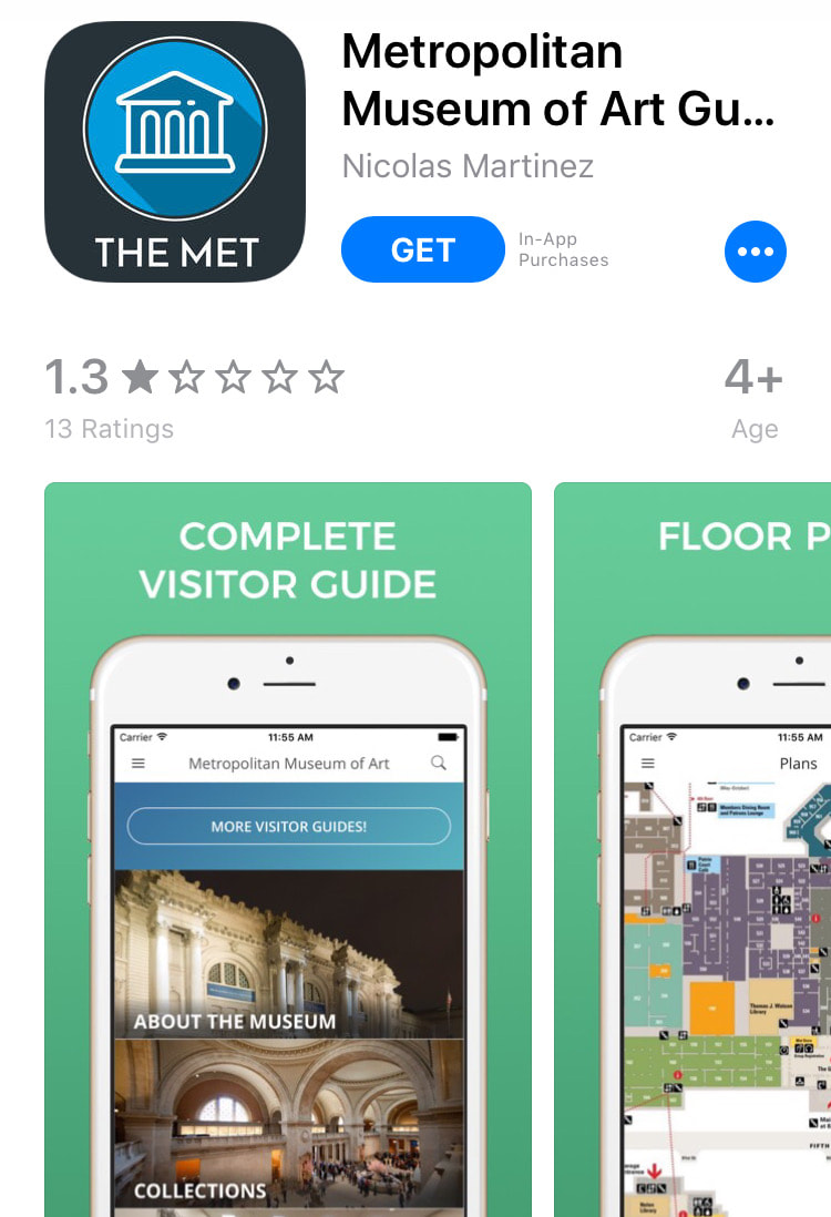
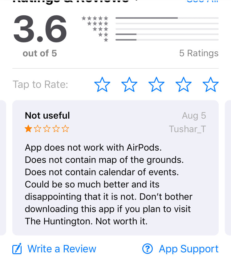
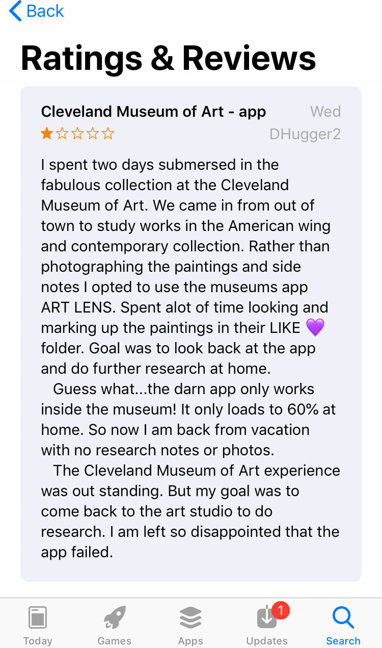
 Smartphone apps are BIG; people love them—over 200 billion were downloaded in 2018. I love apps too. I also love museums; yet there’s only a couple of museum apps I love. This article delves into museum apps: the research on visitors' perspectives, key challenges, and reviews a selection of good and bad examples, as well as recommendations on how to fix them. First things first, museums should consider apps for a few reasons, primarily because people are increasing their use of mobile internet and using apps more. They’re using smart phones to access information, education and entertainment, and, doing so through apps. App downloads are expected to increase 45% by 2022. They also account for 87% of time spent on mobile devices. The shift is significant. Adapting to visitors' online behaviour change is an opportunity for museums to attract and sustain new visitors both in-person and virtually through digital applications. Data on Museum Apps The data on museum app usage is pretty thin, but a report by Colleen Dilenschneider who collects and analyzes data for cultural organizations describes museum app usage in 2017 and 2019. It reveals low usage rate for museum apps in comparison to other media for visitors planning a museum visit (chart below). It also reveals that museum apps don’t deliver higher satisfaction levels compared to other information sources during an on-site experience. 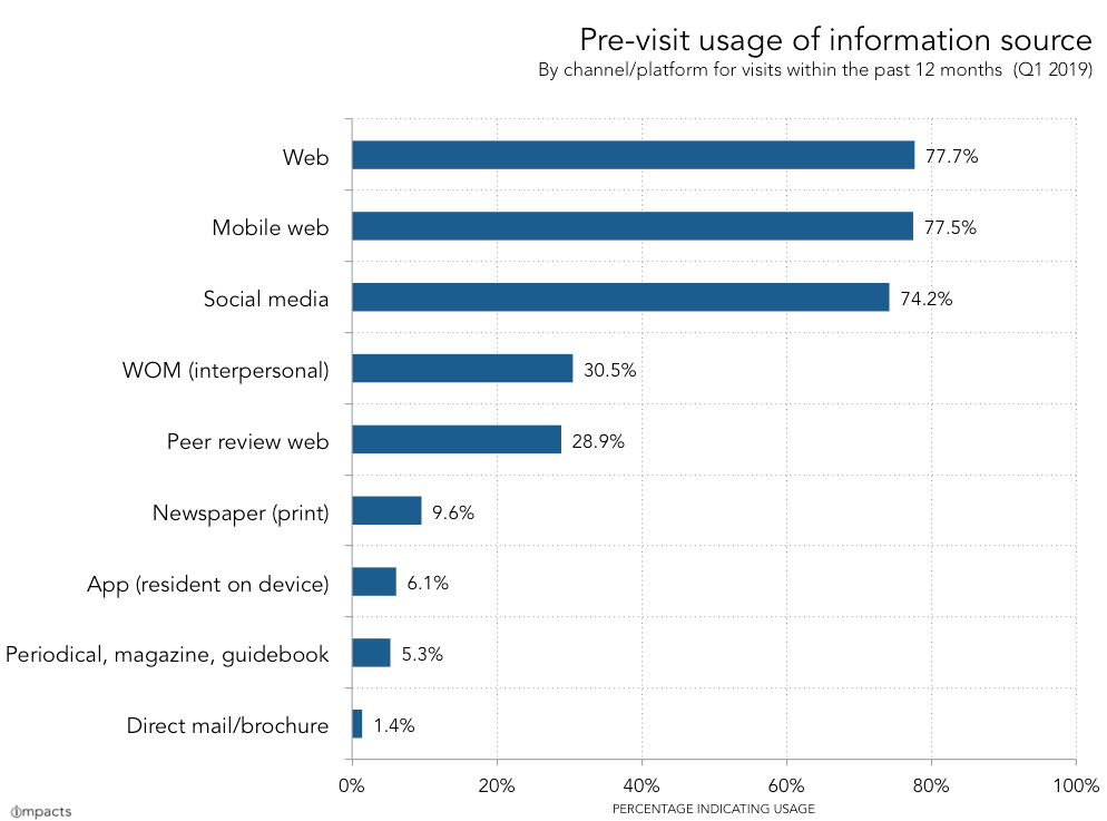 Chart from 'Musing On A Mobile App for Your Cultural Organization? Read This First', Colleen Dilenschneider, (May 1, 2019) colleendilen.com Note: "WOM": word of mouth, "Peer Review Web": consumer sharing sites such as Yelp and Trip Advisor What’s a Museum to Do? Should museums even bother with apps given the data that suggests low usage rates? YES they absolutely should. Museums can’t afford to ignore the shift towards app and mobile usage and not dig deeper. Below are factors I suggest contribute to low satisfaction levels, along with a deeper dive into the fundamental problems with museum apps in general. Why Most Museum Apps are Brutal Though it sounds harsh, the majority of museum apps stink—I’m not the only one who thinks so. Just read customer comments on any number of museum apps on the app store—people are pretty blunt; comments include, “horrible”, “does not work with AirPods”, “crashes”, “not worth it” and more. Factors impacting satisfaction include: technical issues, ‘official’ apps versus those developed for profit by outside parties, app design that is poor and/or not intuitive, apps lacking key information like address, admission info, etc. Another issue, most museum apps aren’t integrated into the museum’s strategy—they’re not promoted in museum materials, on the website, or inside the museum. This disconnect affects adoption rate and sustainability. 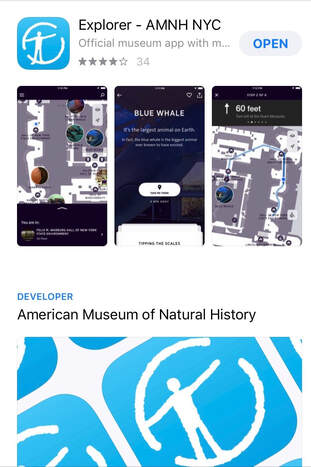 Screenshot American Natural History Museum's app. It says 'official' in the title--helpful for differentiation over third party apps. Screenshot American Natural History Museum's app. It says 'official' in the title--helpful for differentiation over third party apps. Fundamental Problems ‘Official’ vs Not Some apps are not developed by the museum but by a third party—typically for profit. These apps appear to be the museum’s official app, but aren't. This can create problems, one being that the integrity of the museum might be compromised. The British Museum in London for instance, doesn't appear to have its own app, but there are at least four developed by outsiders. All offer in-app purchases; most have poor customer reviews (see image gallery). Some museums that have their own app, as in the case of the Louvre and The Getty, but are competing with others. There are at least two apps marketed to Louvre and Getty visitors that are developed by outside companies. The American Natural History Museum addresses the problem by stating "official" in the app's description directly beneath the app's title. This is helpful. Technical Barriers Technical barriers are significant, they include battery drain (mostly for navigation when visitors’ location is tracked on their phones), downloading app content which takes up storage on the phone, crashing and freezing, and audio tours only working with plug in earbuds. Finding the museum’s app in the app store is another barrier— apps that don’t include the museum name creates confusion (one example is Cleveland Museum at Art's app named 'Artlens'). Purpose (?) Apps are typically designed for two purposes either for visitors to, 1) plan a visit: getting information on hours, fees, current exhibitions, parking, events, etc., OR, 2) for the museum visit: navigating within the museum, self-guided tours, exploring the galleries, and audio guides. A handful do both. Most do neither well. Few apps provide a digital experience designed to go beyond the visit. This (third) category presents an opportunity for museums to sustain engagement by providing a education or entertainment to visitors who have already visited, or are interested in the museum. A Disconnect There’s often a disconnect between what’s offered digitally via the museum app and the in-person experience. Usually there’s no mention of the app on museum materials (e.g. maps), signage, or on museum exhibit labels. Even within museums "planning a visit [web] pages", apps are rarely mentioned. Image gallery below with screenshots of select museum apps and visitors comments. 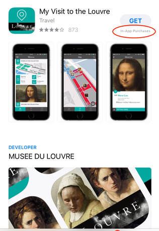 Screenshot of the Louvre app; developed by Louvre yet offers 'in-app purchase'; not consistent with most museums offering their app for free Screenshot of the Louvre app; developed by Louvre yet offers 'in-app purchase'; not consistent with most museums offering their app for free Review of Museum Apps I rate the following apps on: ease of use, quality of content, and educational/informational value on the three dimensions mentioned: 1) planning a visit, 2) in-museum experience, and 3) post-visit or digital exploration. "Needs Improvement" British Museum: No official app available. For a museum of this scope, size and ranking, I’d expect the museum to have its own app, more so given that other developers have jumped in the fray with poor quality apps that appear to be ‘official’. Explorer, American Museum of Natural History (AMNH), New York City: Kudos to AMNH—they have an ‘official’ app and make it clear. Explorer seems effective for an in-museum experience with location based guidance. It includes a robust section on amenities. The big drawback—it lacks any information on planning a museum visit—it doesn’t even include the address of the museum (!), directions, or the hours. However you can purchase tickets. Overall it’s a huge miss. Reviewers also complain about battery drain due to location tracking. My Visit to the Louvre, Louvre, Paris. It appears to be the official app; it focuses on the in-museum experience. But it includes an in-app purchase for the audio guide. This is a poor decision on the Louvre’s part—it seems stingy and doesn’t align with other museum practices. Charging visitors for the audio guide who download the official app creates a barrier to engagement; it's also confusing given several apps by ‘unofficial’ developers all with in-app purchases. Artlens by Cleveland Museum of Art. A fairly good app designed for the in-museum experience, but there are issues. Though the tours are its best feature (there are several including some designed by visitors), it’s not intuitive. One section on the app titled ‘YOU’, is designed for the user to add favorite works of art, though instructions are vague. Apparently you can add works “from the ARTLENS Wall”, but it’s not clear where the Artlens wall is. The app also doesn’t much value for planning a visit—there’s no address, directions, or details on admission, though it does display hours and events by day. Another downside—it takes up a big chunk of storage space—217.5 MB. It's far more than the ask BKM app (rating below) which takes up only 18.3 MB. Even Instagram is far lower at 113.5 MB. 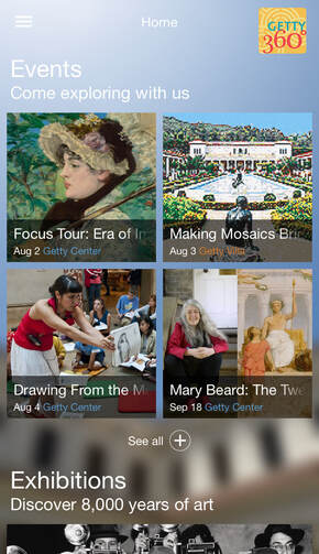 Screenshot of 'home' page from Getty 360 app. Clicking on the image takes users to a screen with a detailed description of the event or exhibition. Screenshot of 'home' page from Getty 360 app. Clicking on the image takes users to a screen with a detailed description of the event or exhibition. ‘"Very Good" Getty 360, J. Paul Getty Trust, designed for two locations, the Getty Center and Getty Villa. A very good app for planning a visit to the Getty with information on both locations including events, exhibitions, and detailed information on amenities including restaurant menus. There’s also an ‘About the Getty’ section and a downloadable map. Getty 360 is great for the pre-visit, though it could benefit with a function to search the collection, or include a collection highlights. Art Institute of Chicago, the Art Institute of Chicago. A good app geared to the in-musuem experience; there are over ten audio tours that are well done. There’s also a punch-by-number audio guide for the permanent collection. However you need plug in headphones to hear the audio. The ‘Events’ section is good with a calendar view. But the info section is weak; a ‘Become a Member’ banner displays at the top of the information page before the museum information. Museum information is minimal; only the address and hours are listed. Navigating within the app is poor. Overall the app is very good for in-museum experience, but poor for planning a visit. It has potential for a digital experience with its offering on current exhibition tours. 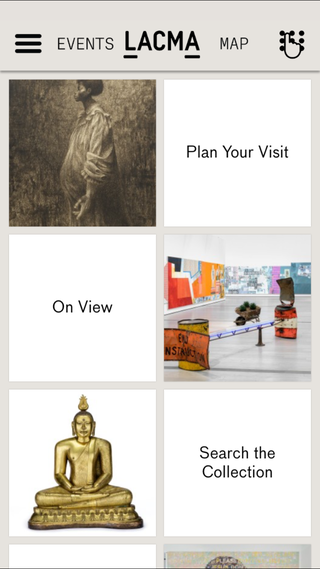 Screenshot of home screen from LACMA's app. Very user friendly, intuitive. Screenshot of home screen from LACMA's app. Very user friendly, intuitive. "Excellent" LACMA, the Los Angeles County of Art. It hits all three criteria; plan your visit with comprehensive information including an event calendar. It supports an in-visit experience with an audio guide, descriptions and directions to current exhibitions, a map with amenities, and my favorite—a search the collection feature. Best of all there are the detailed descriptions of current exhibitions that include excellent overviews and videos. LACMA app also works well for a digital experience. Exceptions: some reviewers mention the app freezes; you need separate app for a digital membership card, and you can’t purchase tickets from the app. 'Outstanding': The Future of Museum Apps askBKM by Brooklyn Museum takes visitor engagement to a new level with it’s award-winning ASK app. Not only does it have the features for planning a visit (there is a section that takes users within the app to the museum’s mobile website), but it encourages dialogue between a museum engagement team that includes art historians, educators and curators. Visitors can, “ask questions, share insights via live one-on-one texting” according to the Brooklyn Museum’s website, and “It’s easy and fun, and you’re in control the whole time." 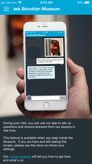 Recommendations
Should museums have their own apps? This question reminds me of the time when Facebook (FB) came on the scene and organizations were considering whether they should have a FB page or not, as I said then—it’s not a matter of should, but a matter of when. It's the same with museum apps--it's not should we, but when should we. My advice for museums who plan to, or are in the process of building an app:
I hope I have provided some ideas for museum practitioners and visitors; in the meantime I’ll continue trying out new museum apps and write an update post in the coming months. Note: All app screenshots appearing in this post are from Apple app store |